
Client: The Williams Center | Art Direction: Sam Peek & Zack Bujazia | Incredible Marketing
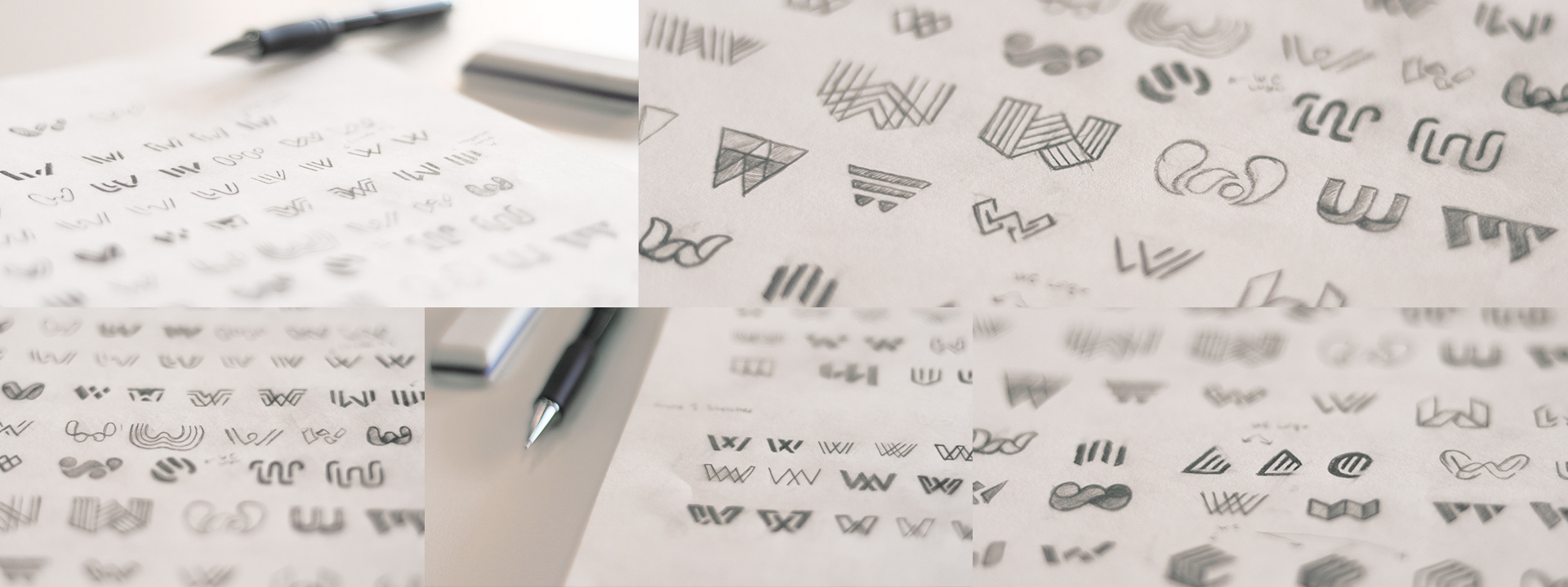
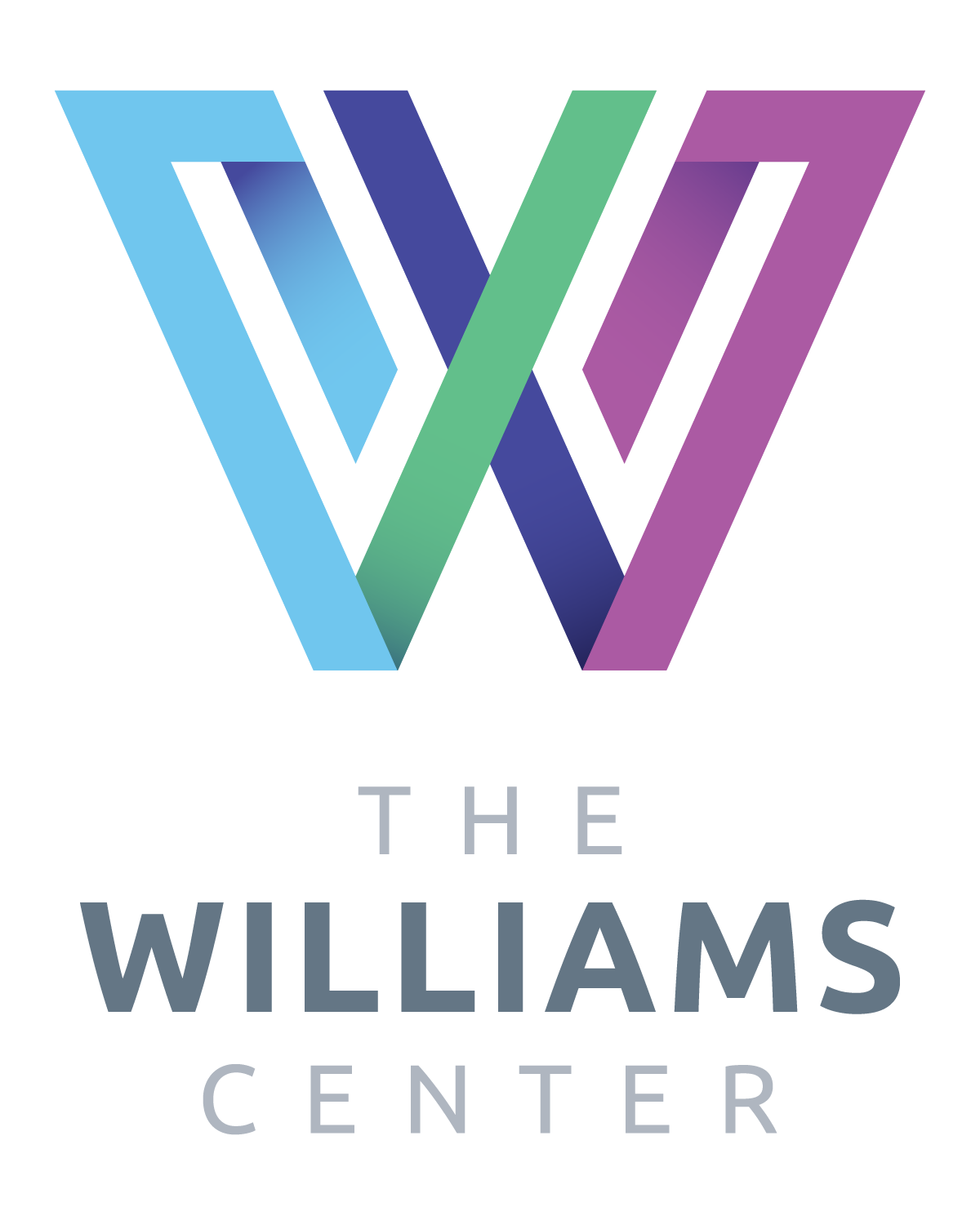
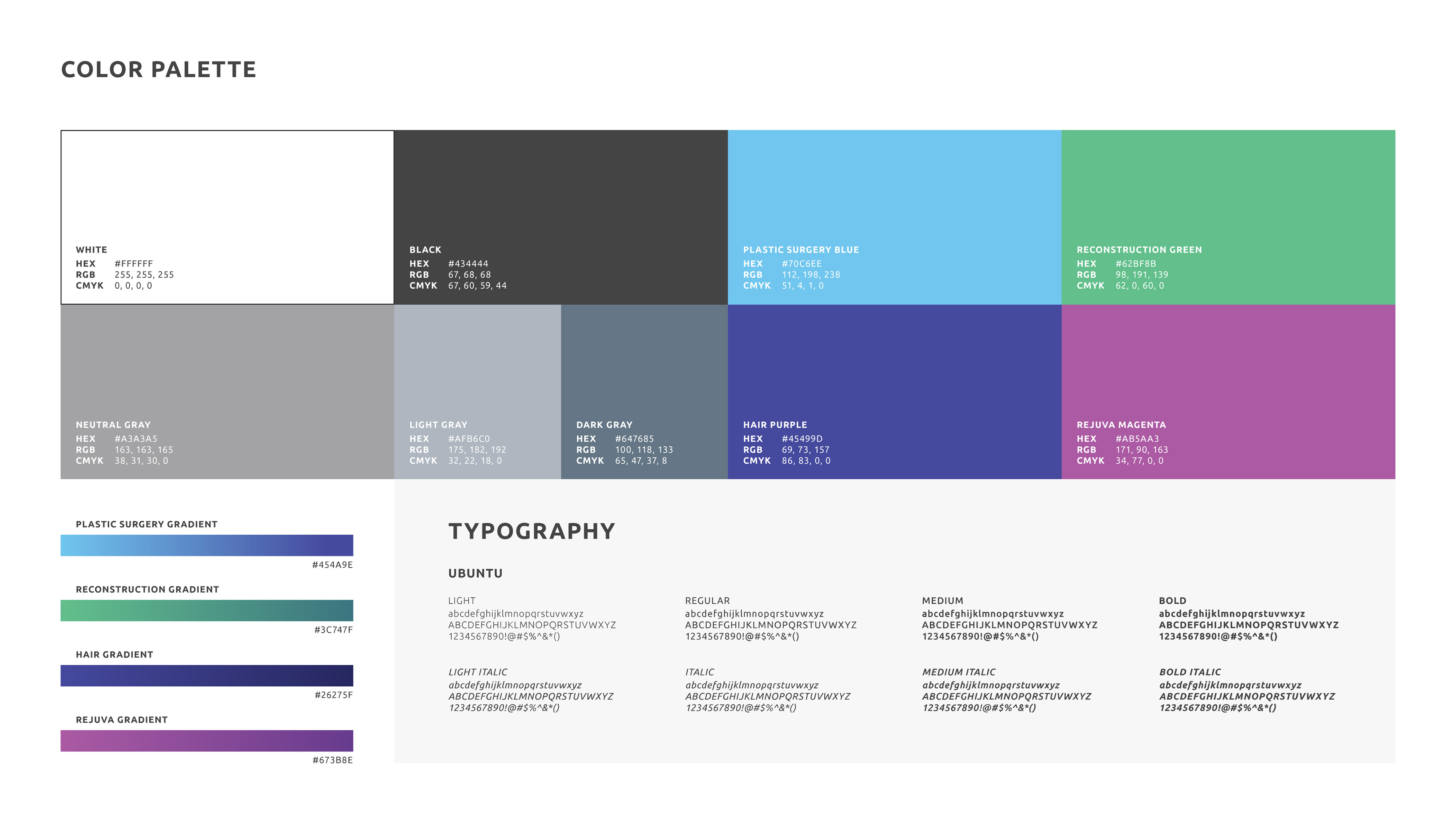
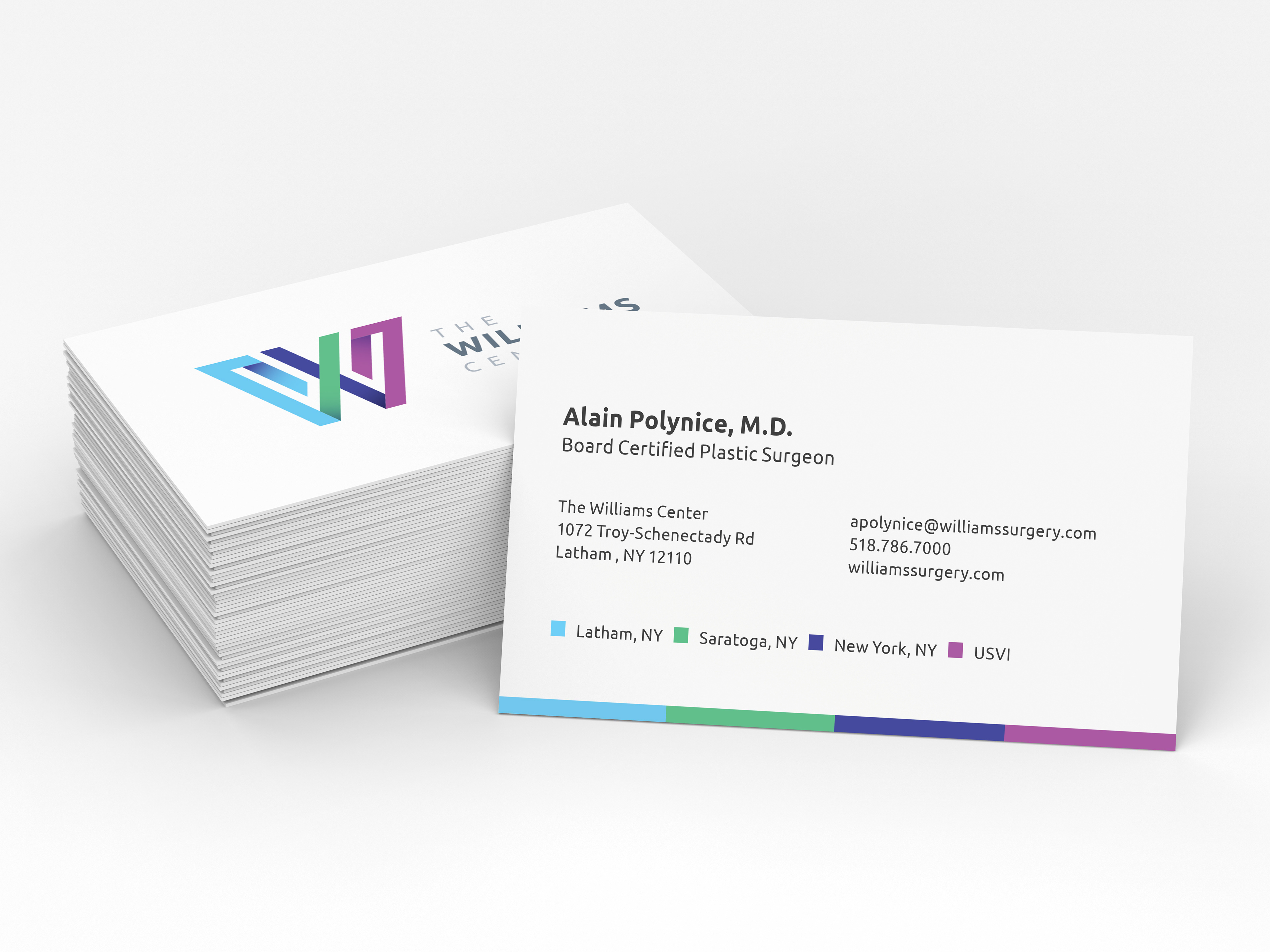
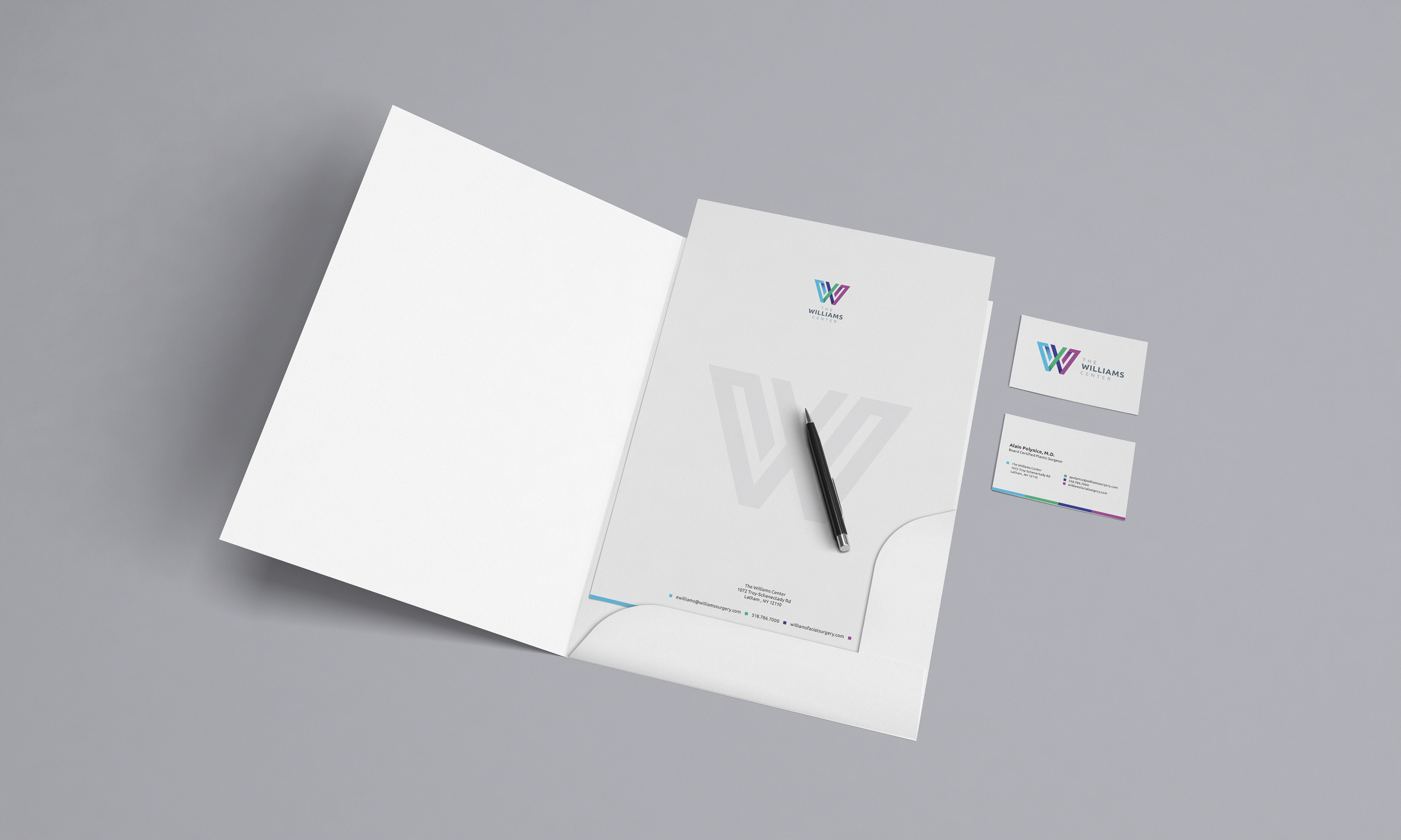
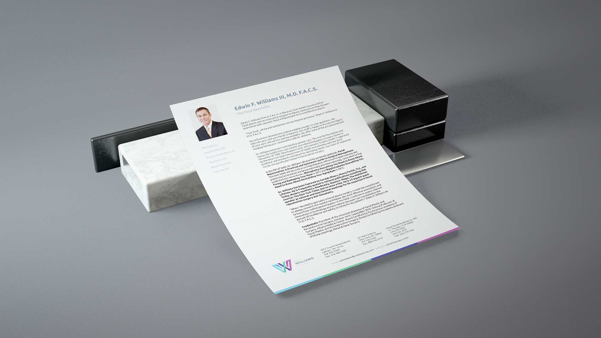
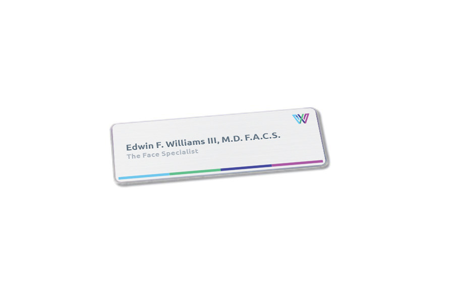
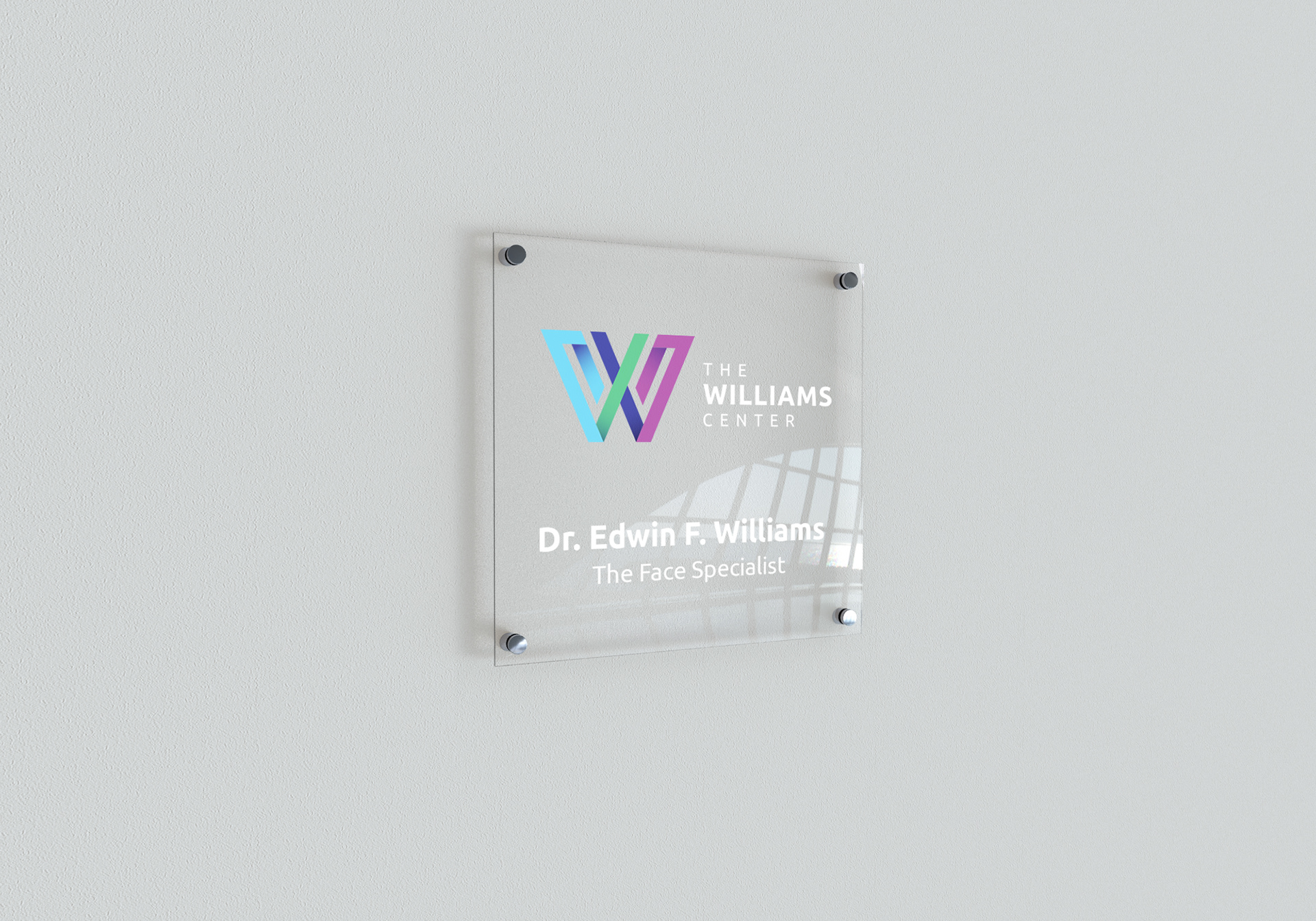
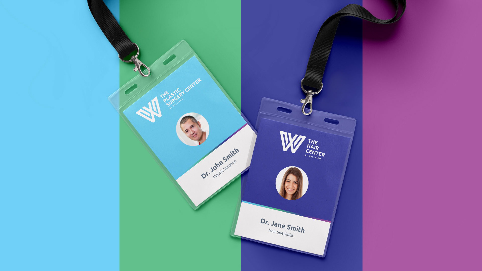
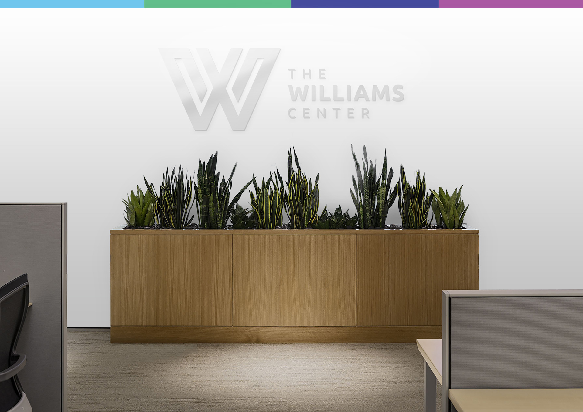
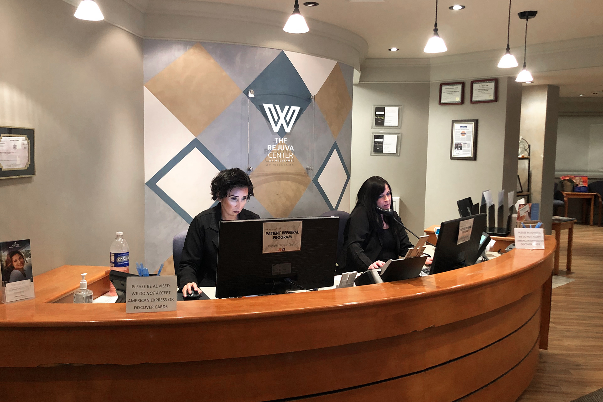
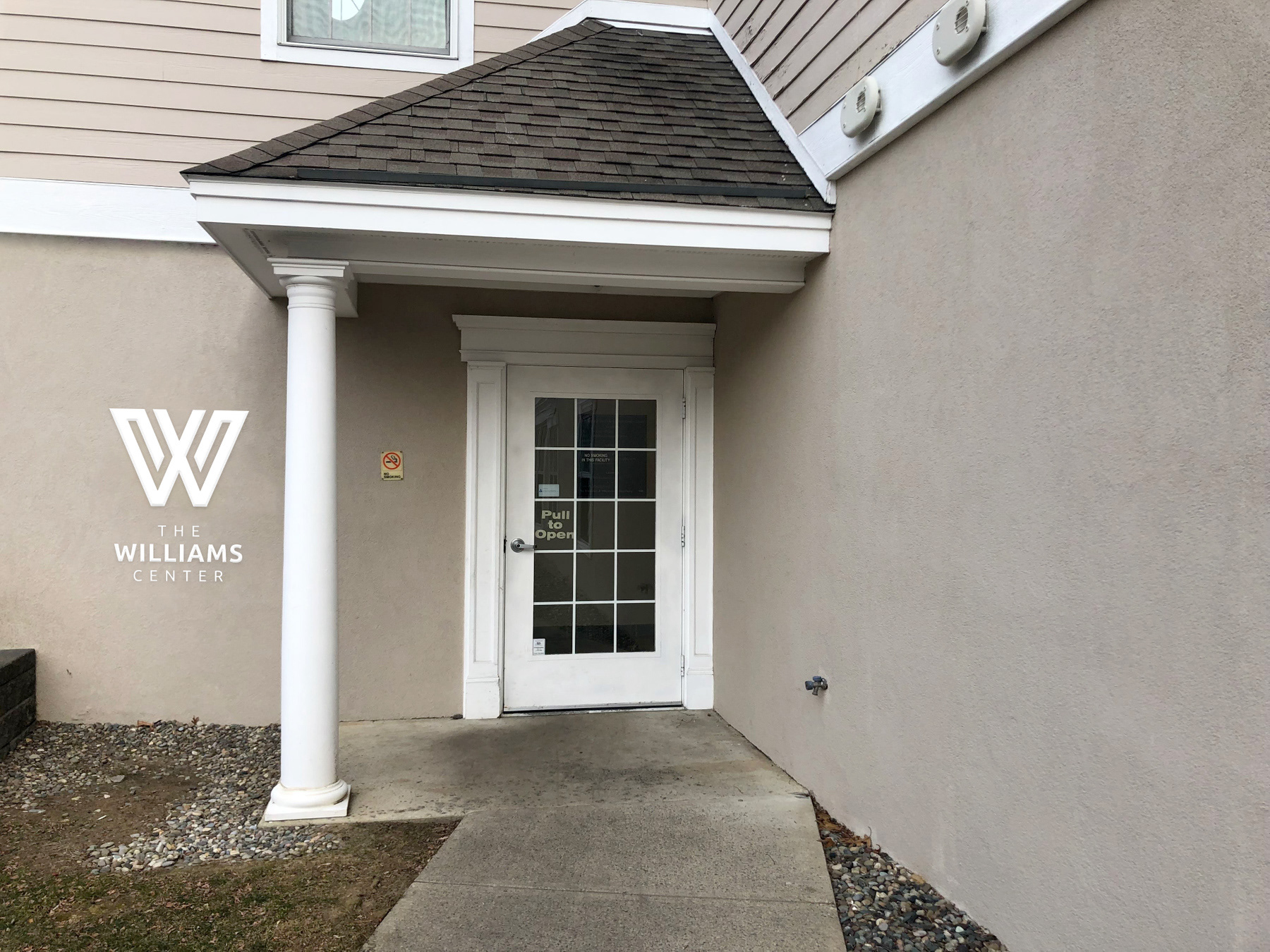
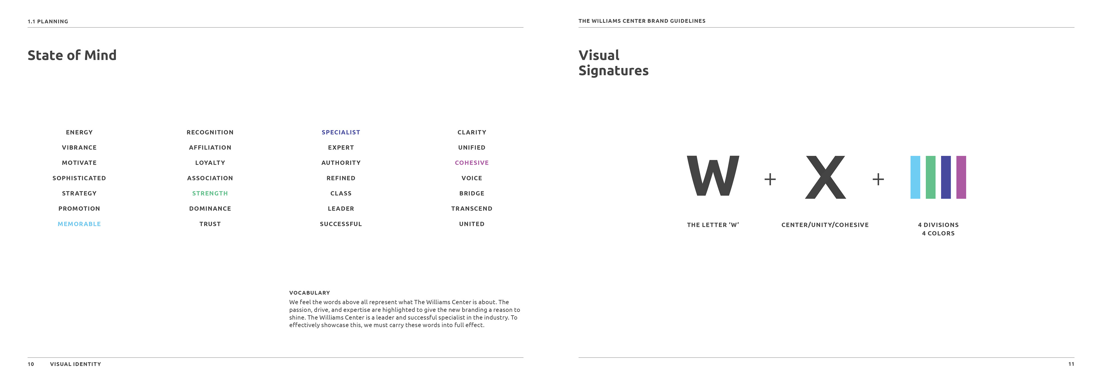
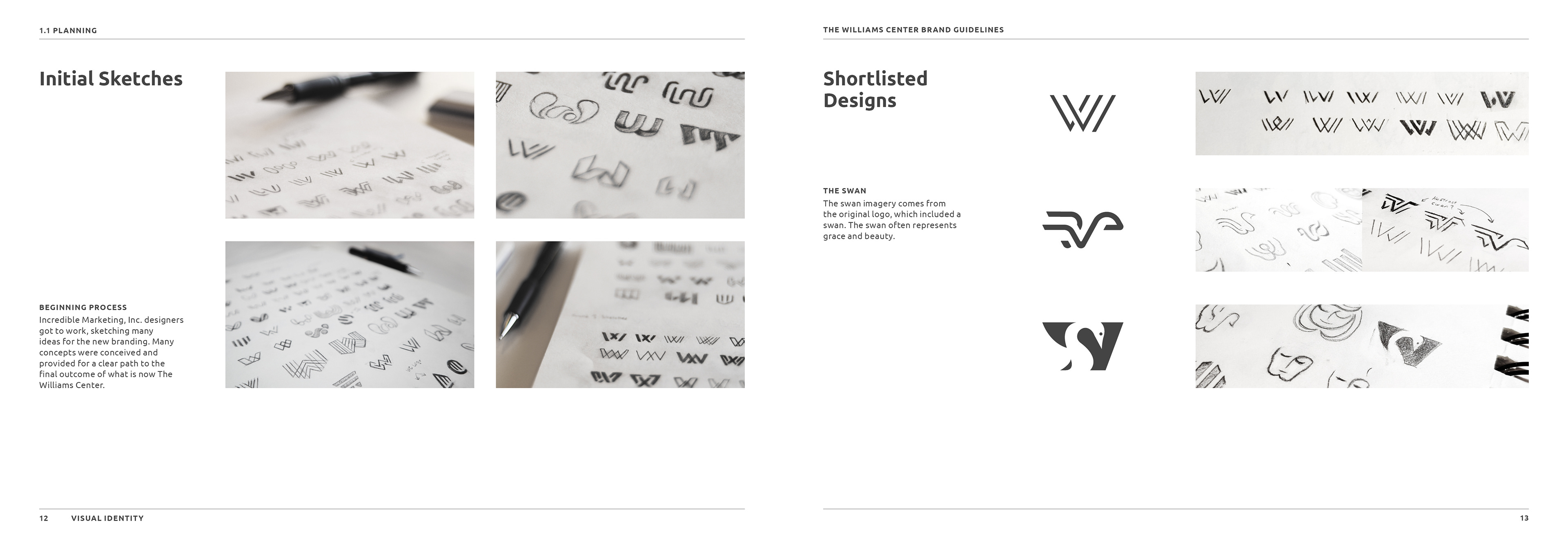
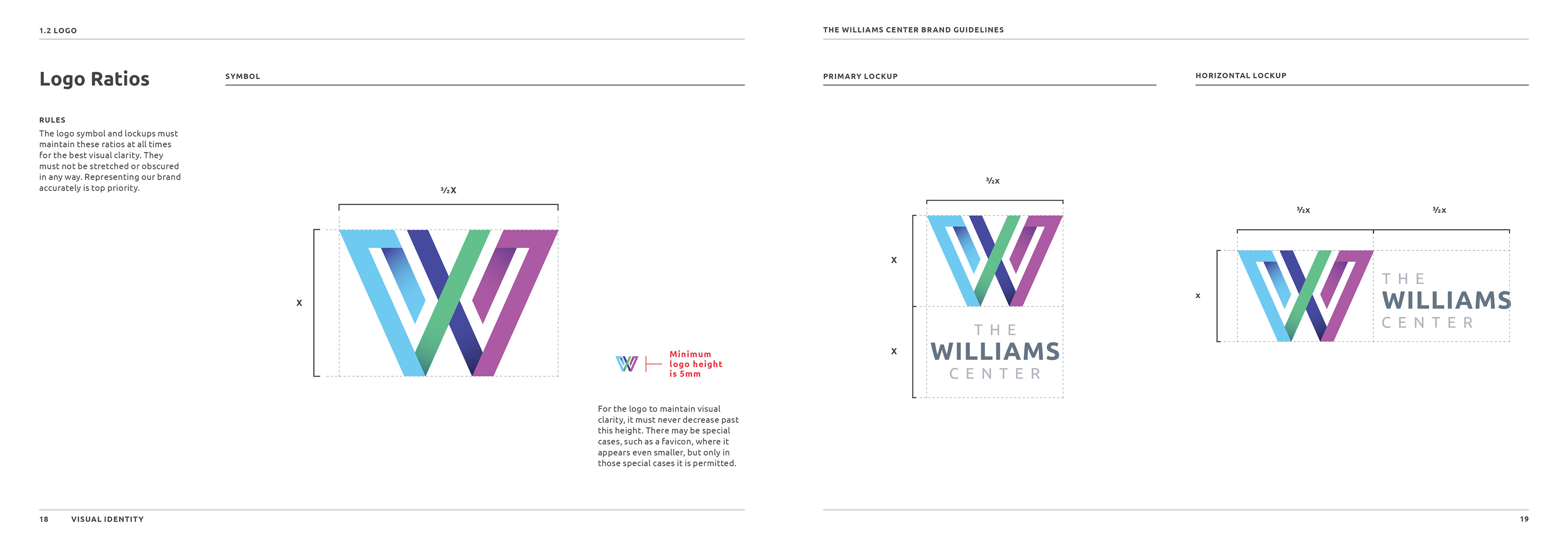
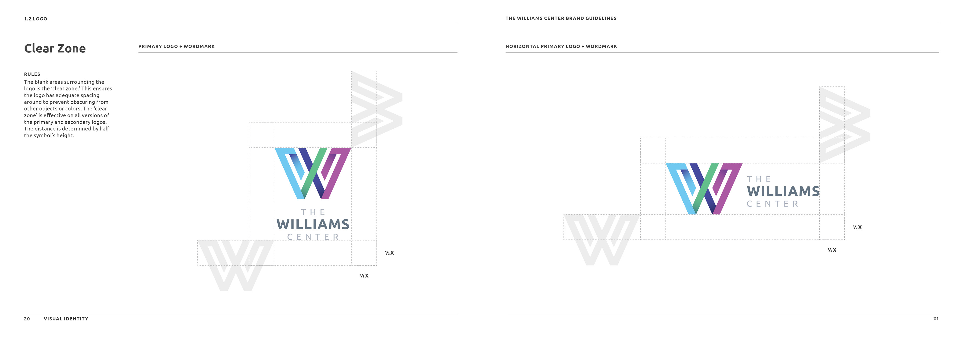
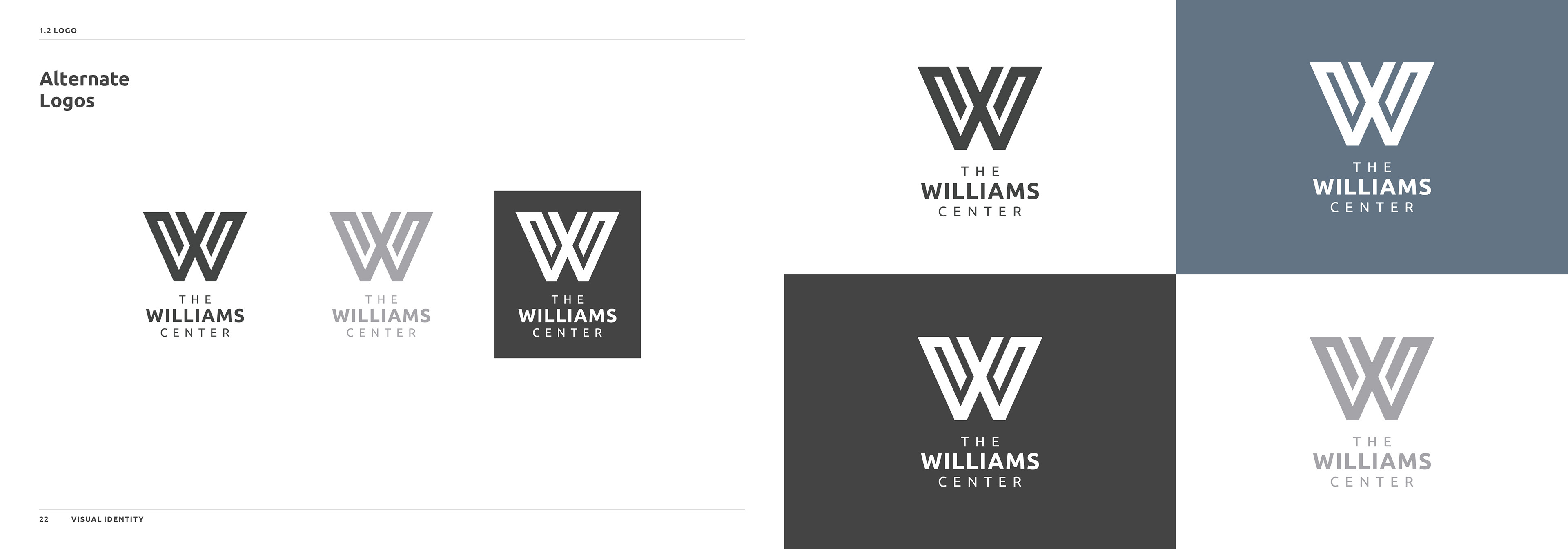
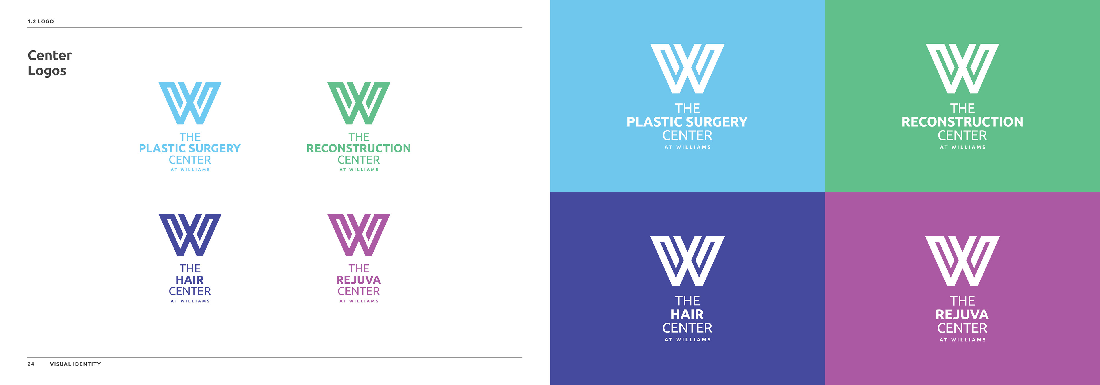
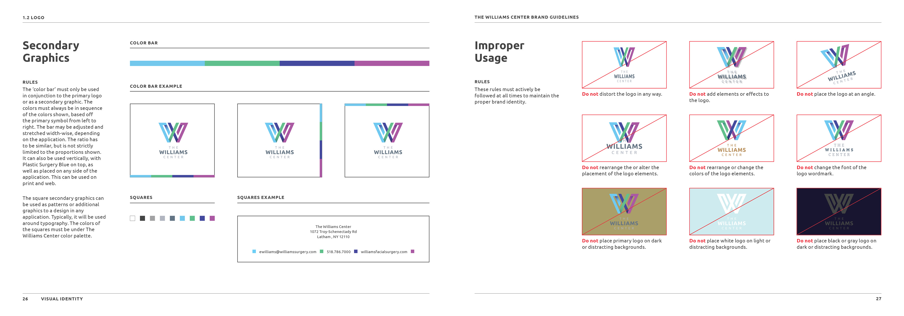
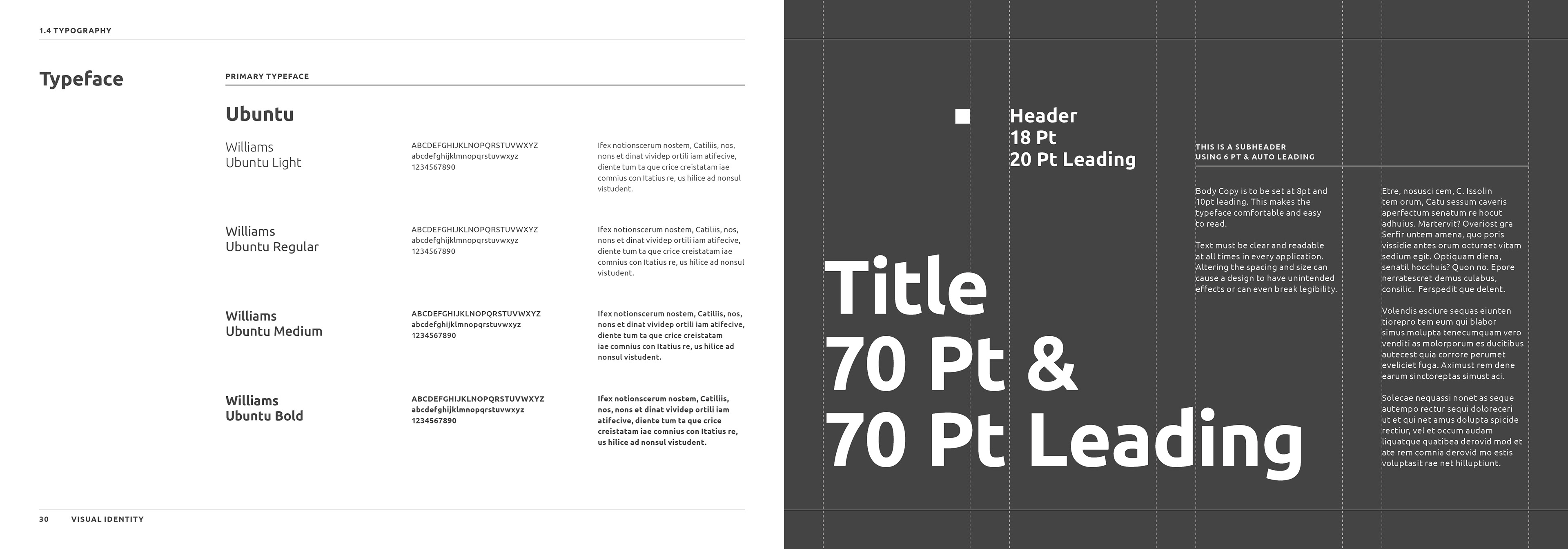
Identity Rebrand for The Williams Center. This was an ambitious rebrand of a very established medical group. Starting with the logo, I created a modern and recognizable symbol that focuses in on the "W" of Williams that is separated into 4 colors. Each color represents the 4 doctors and the 4 branches of Williams. The "X" shape in the middle symbolizes that each branch crosses together and works together as a whole. What followed after was an entire system that followed these colors and branches for any application, whether it be print or digital. It would be very easy to use them cohesively, as well as separate when needed.